The fine line between art and graphics suggests that the latter is merely a matter of taste. As the saying goes: “Taste and colour are not debatable”. While this may be true when it comes to appreciating a work of art, it does not apply to graphic design, which must convey a specific message. Indeed, despite the many possible styles, a graphic design must first be right before it is “beautiful”.
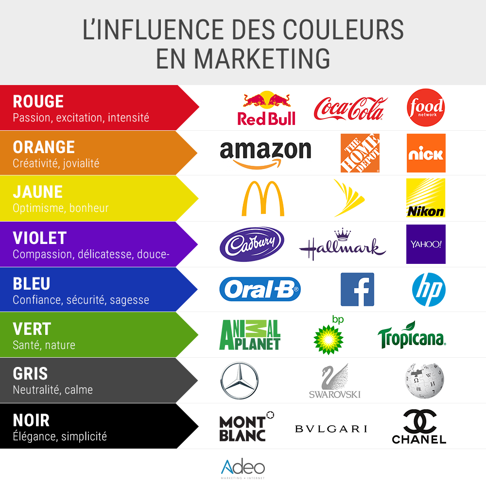
The shapes and colours have their meanings, so they must be used wisely.
WHY IS YOUR VISUAL IDENTITY IMPORTANT?
For you, it is the link between your school/company and your alumni association and helps maintain your members’ sense of belonging. It also allows for immediate recognition on your communication media, from your website to your personalised pens with your image and your posts on social networks.
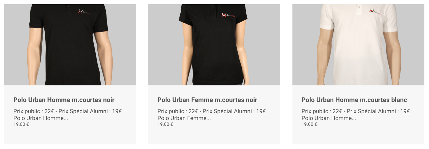
The TBS Alumni shop offers T-shirts with the association’s logo.
DOES YOUR VISUAL IDENTITY CONVEY YOUR VALUES?
THE STARTING POINT: THE LOGO
While it’s likely that you’ll hire a professional to create or redesign your visual identity, it’s not out of the question to keep a keen eye on the subject to ensure the integrity of your message. Here are some examples (among many others) of good logos among our clients:
Supbiotech Alumni (groupe IONIS)
The logo makes an instant link with the school. It has been stripped of the graphic elements that burdened the composition and stands out with colours that contrast with those of the school, thus allowing immediate recognition as an alumni association.
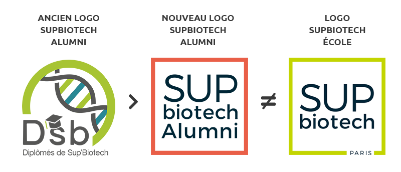
Here, the colours immediately refer to the notion of excellence. The school’s logo is used with the alumni inscription in a size larger than the school’s name to differentiate it from the school.
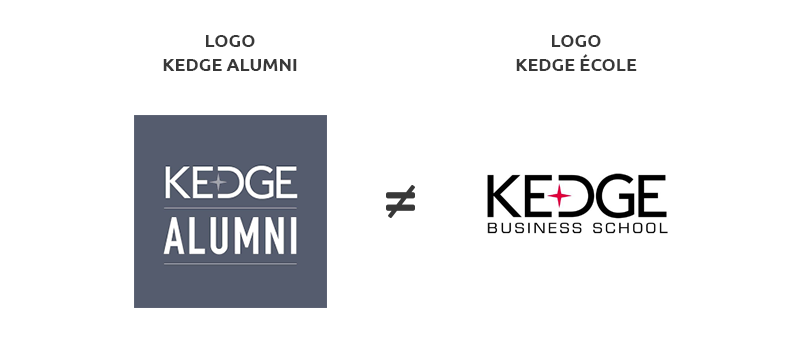
The same observation applies here: the school’s identity is reproduced in its entirety, except for the word “Alumni”, which appears in a larger size.
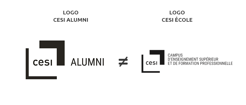
These logos, by their simplicity, are guaranteed to be long-lasting because they do not contain superfluous elements that will pass with the fashions, they adapt to any support and are recognizable at first glance.
TYPOGRAPHY
Like a brand, your identity should not be limited to a logo. The typography, colours and illustrations used must also be included in a graphic charter that defines a framework for creation. As far as possible, respect the typography defined in your charter or, failing that, the one present in your logo.
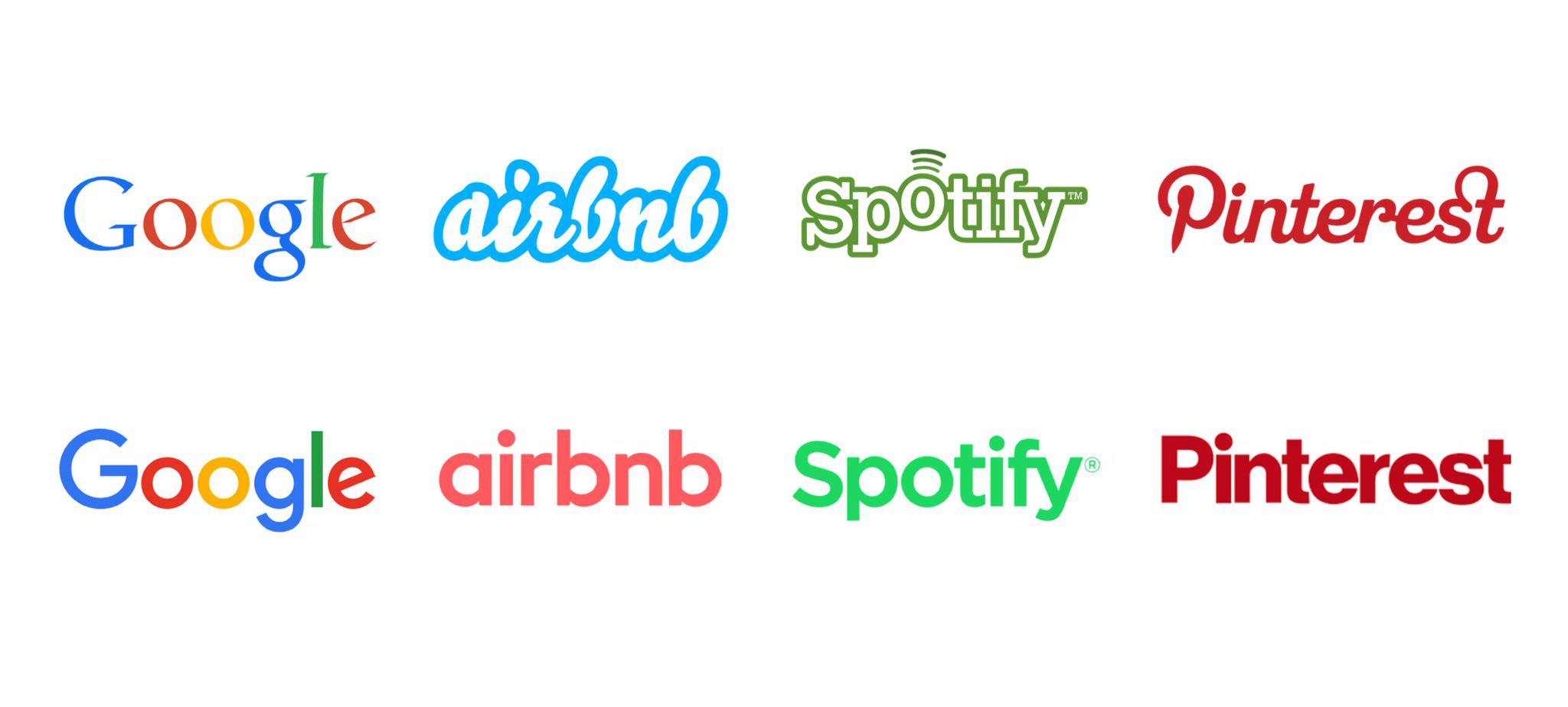
Today, the trend is towards bold sans serif fonts. They offer better visibility on all mobile media and it is no coincidence that all the major groups have developed their logos in this direction. This simplification allows greater consistency with the interfaces.
Rappel : Serif | Sans Serif | Regular | Bold
THE BRAND IMAGE
This fashion also comes from the fact that these groups have understood that the logo alone is no longer enough to make the brand, but it is above all the products and services offered around a global vision that will build their image. When we think of Nike, we don’t just think of the famous comma, but also of everything the brand has built around it, the philosophy of life it wants to evoke: surpassing oneself, perseverance in the effort, etc.
Your communication must highlight your values. Depending on whether you want to evoke elitism, mutual aid, sharing, human warmth, etc., your visuals must reflect this.
WHICH TOOLS TO FACILITATE MY COMMUNICATION?
In the same way that a punctual, neat and smiling person will start a job interview in the best possible way, a polished graphic identity will have the same positive effect on its audience.
But if you lack time or in-house skills, powerful and free tools exist. In a previous article, we communicated the importance of illustrating your publications with quality images, here are now some tools to edit and include them in your creations.
CRÉATION EN LIGNE
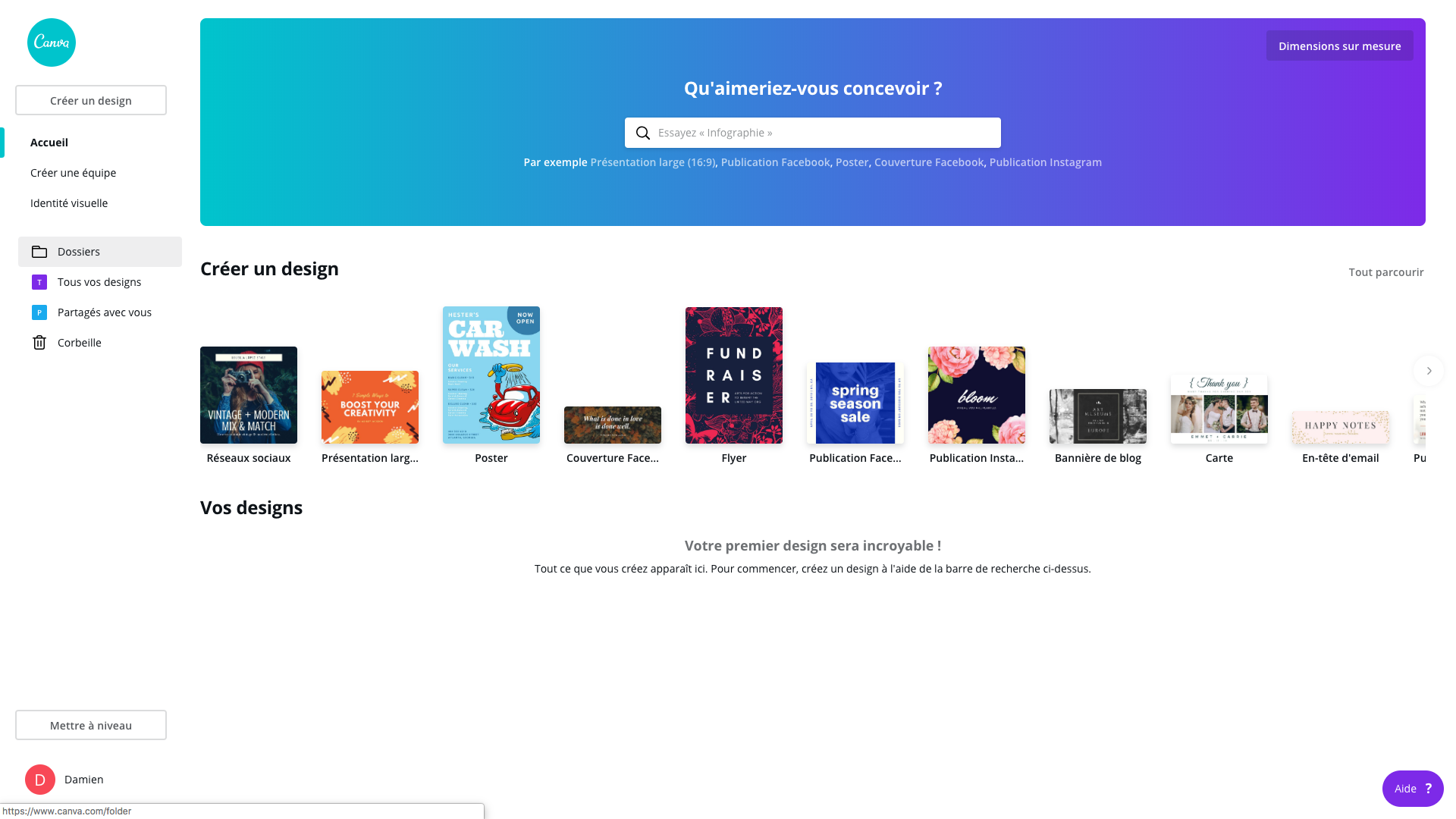
Référence du marché, Canva vous permet de créer toutes sortes de publications print ou web. Une version premium vous permet d’accéder à plus d’outils (redimensionnement, sauvegarde d’éléments graphiques…) ainsi qu’à l’utilisation de photos et illustrations sans restriction.
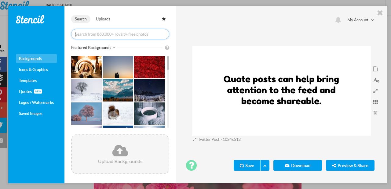
More focused on social networks, Stencil offers a visual alternative to Canva and allows more original creations. Its free version limits the number of possible creations, a subscription is proposed to access more features.
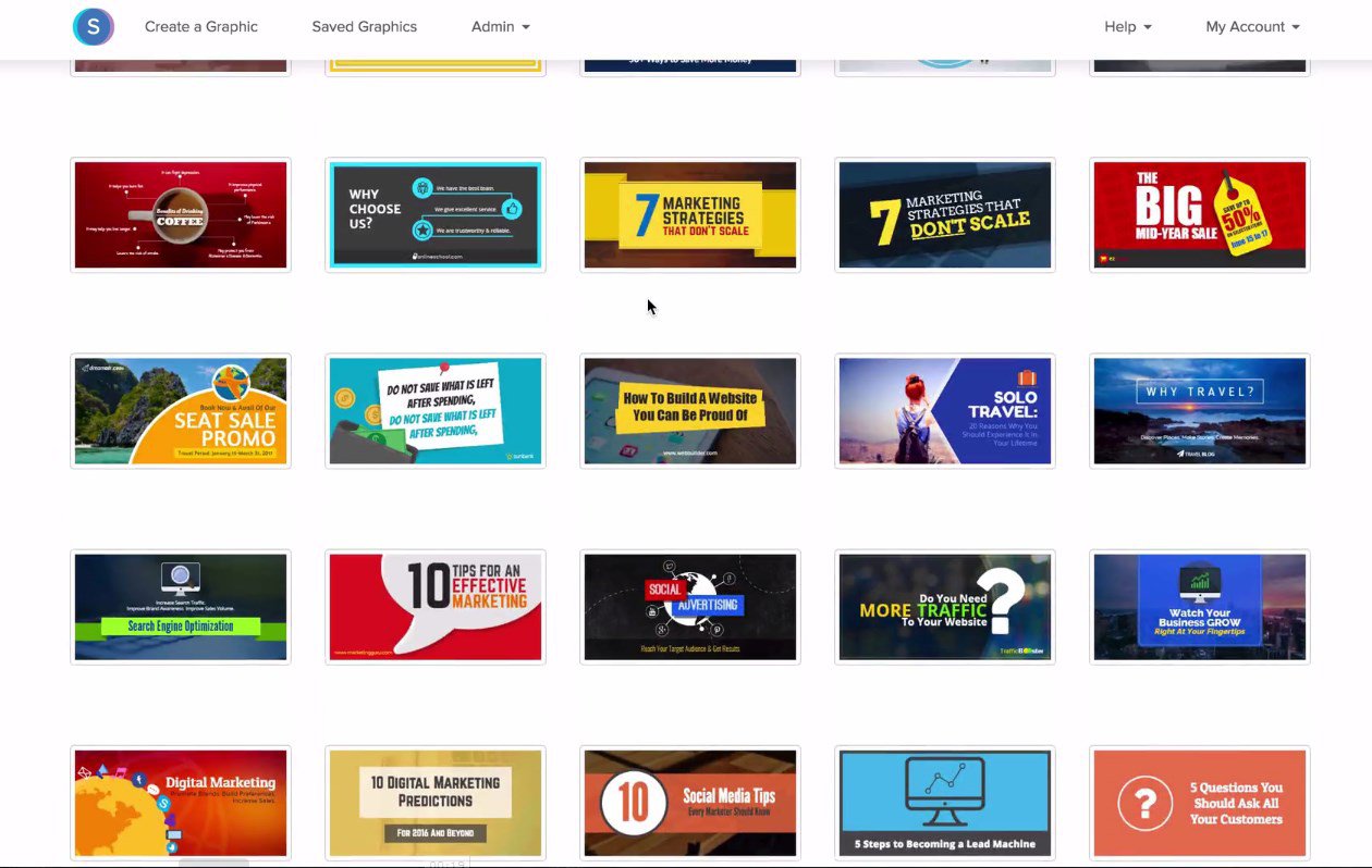
In the same vein as Stencil, Snappa offers a limited free version as well as a paid offer.
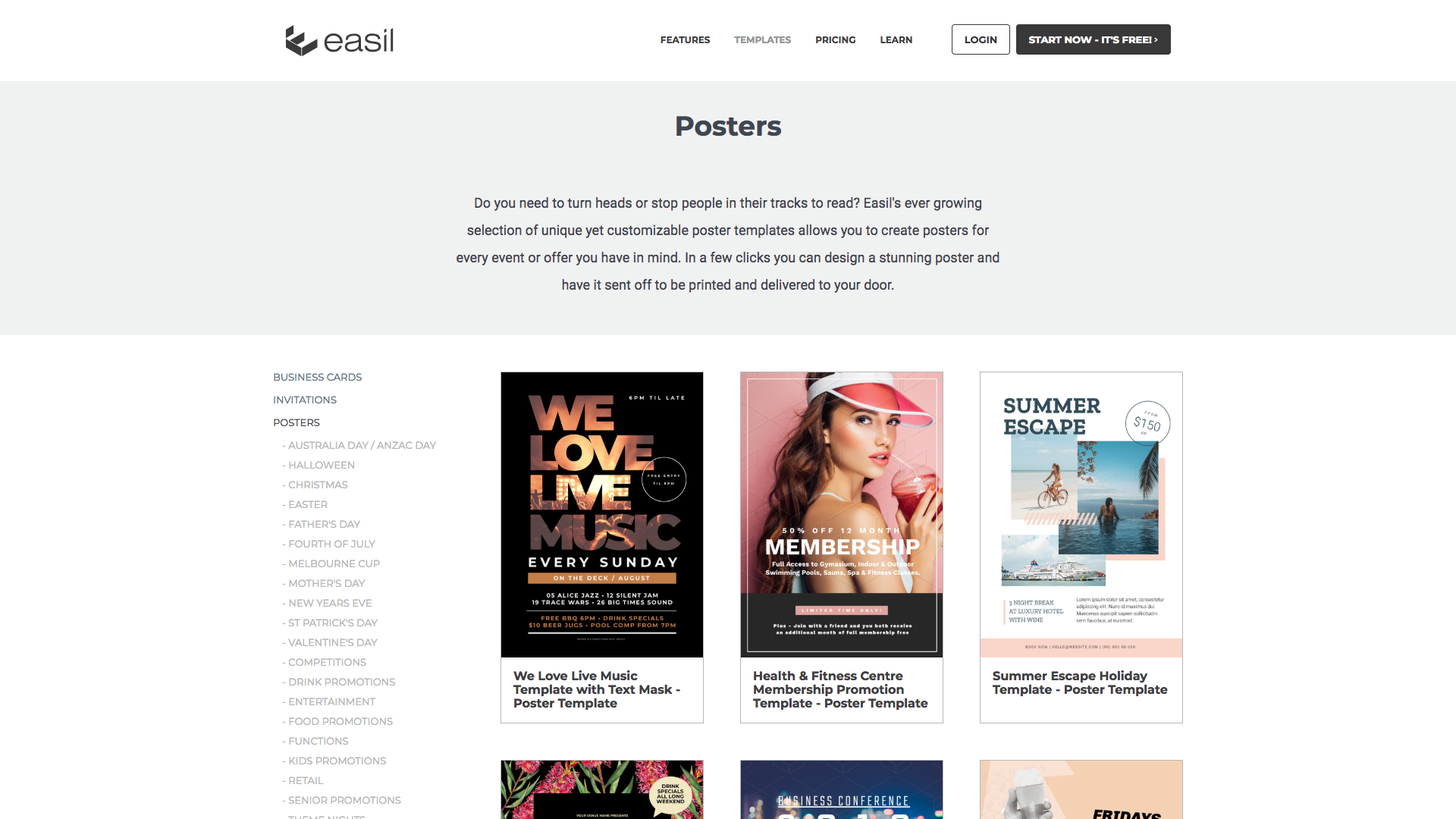
Alternatively, Easil offers a wide range of quality visuals, especially in print, with very different graphic worlds that can be used for any kind of publication.
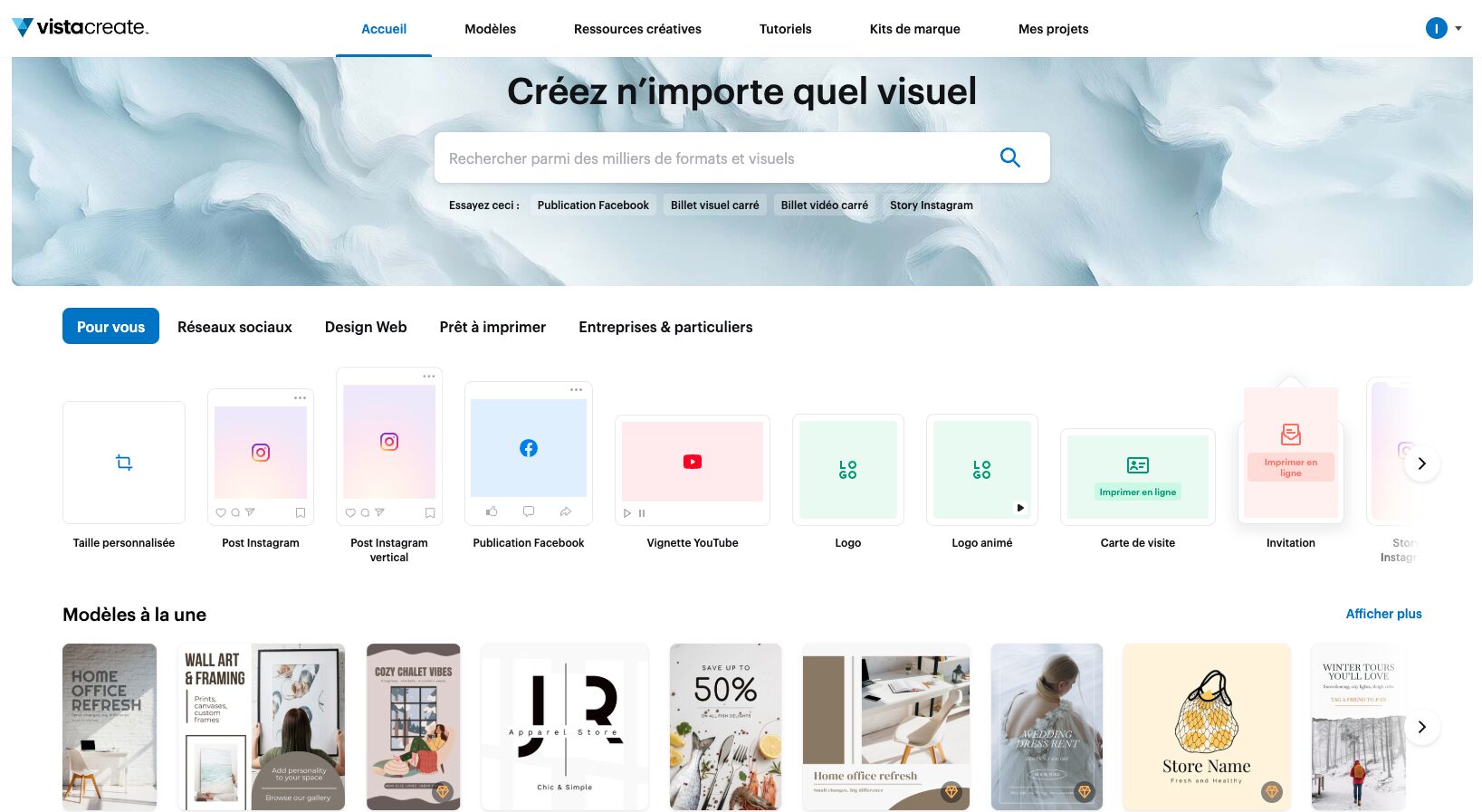
A newcomer to the industry, VistaCreate allows you to create superb animated visuals for a price of $16.67/month. Its free version is unfortunately very limited and is more of a demonstration.
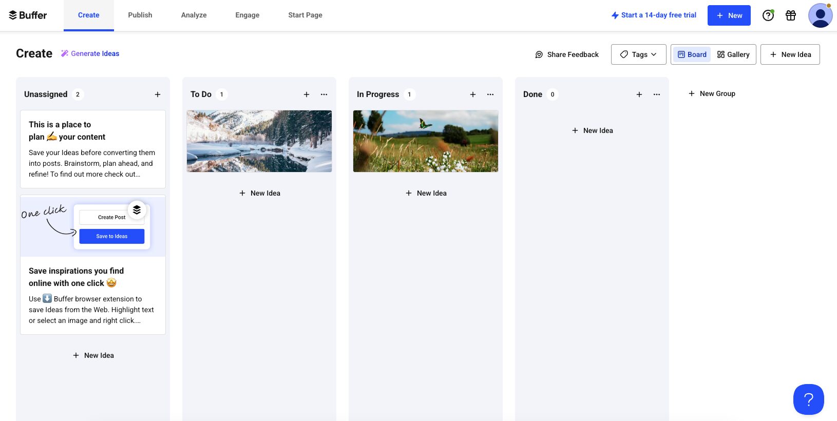
Created by Buffer, an online social network management tool, Pablo is naturally oriented towards digital publishing. It allows simple “quote” type publications with text and logo on an image of your choice.
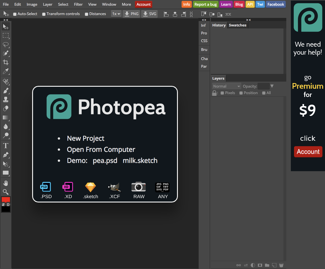
Photopea vous permet de modifier les fichiers provenant notamment de Photoshop. C’est une alternative gratuite puissante qui vous permet de retoucher vos images directement dans l’interface en ligne.
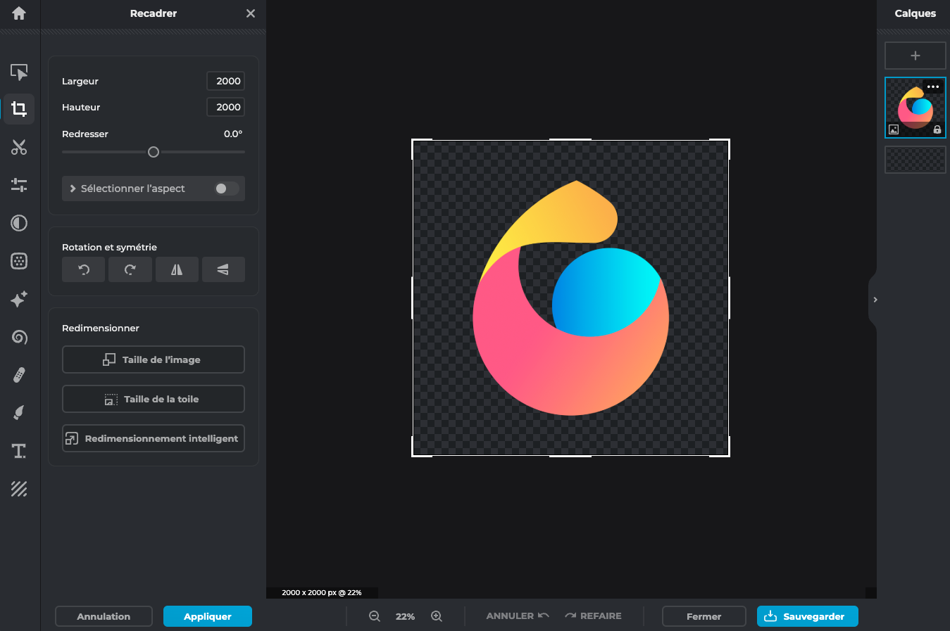
PIXLR
As an alternative to Photopea, Pixlr is very easy to use and allows for easy editing of your images.
OUTILS TÉLÉCHARGEABLES
If you have the resources in-house but don’t want to invest in the Adobe suite, there is free software that will still give you professional results.
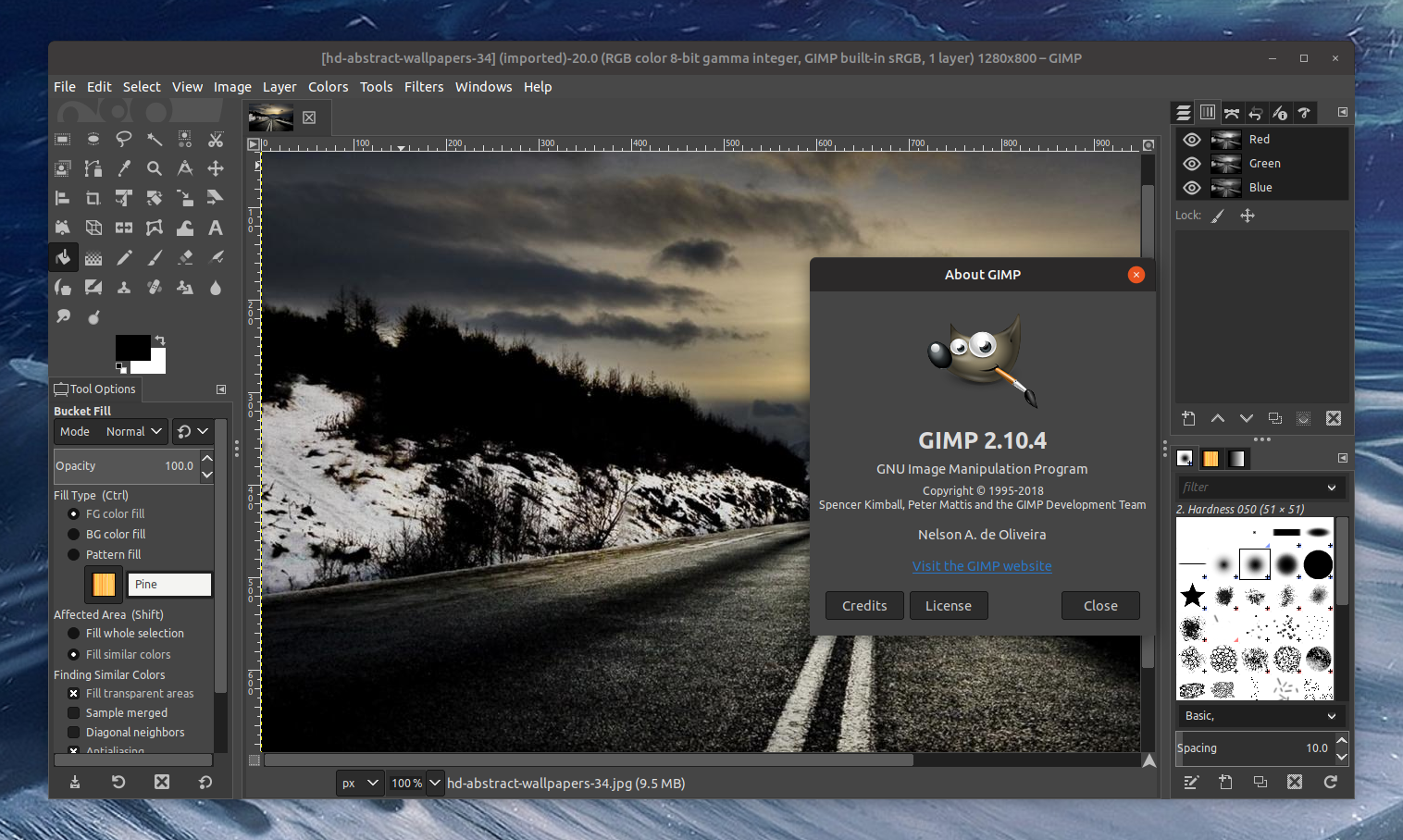
GIMP is free software that works on all platforms and, like Photoshop, offers many tools that online solutions do not. It is especially recommended for manipulating photos or visuals.
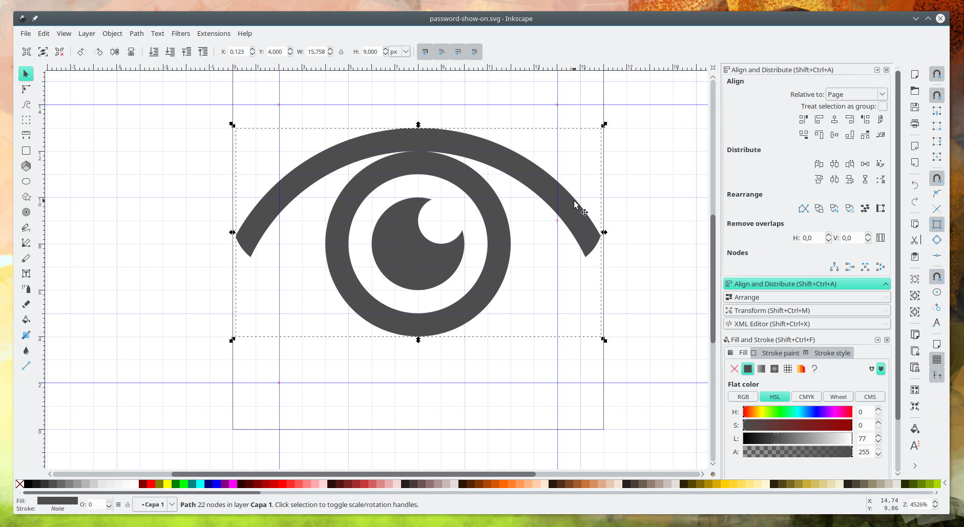
Like GIMP, Inkscape is free and open source, but this time it allows the manipulation of vector images. It is therefore the free equivalent of Adobe Illustrator and allows you to modify your logos, pictograms and icons in .eps, .svg or .ai formats.
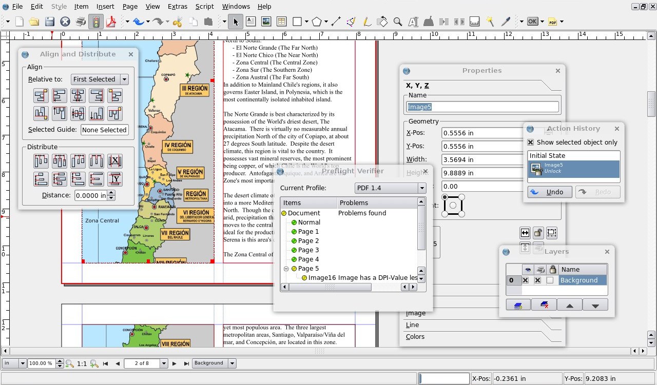
If you are looking for a free software for print publishing, you should look at Scribus, the most complete alternative to Adobe Indesign. Although it is difficult to learn, there are many online tutorials to help you achieve a professional result.
EXPLOIT THE POSSIBILITIES OF OUR SOLUTION
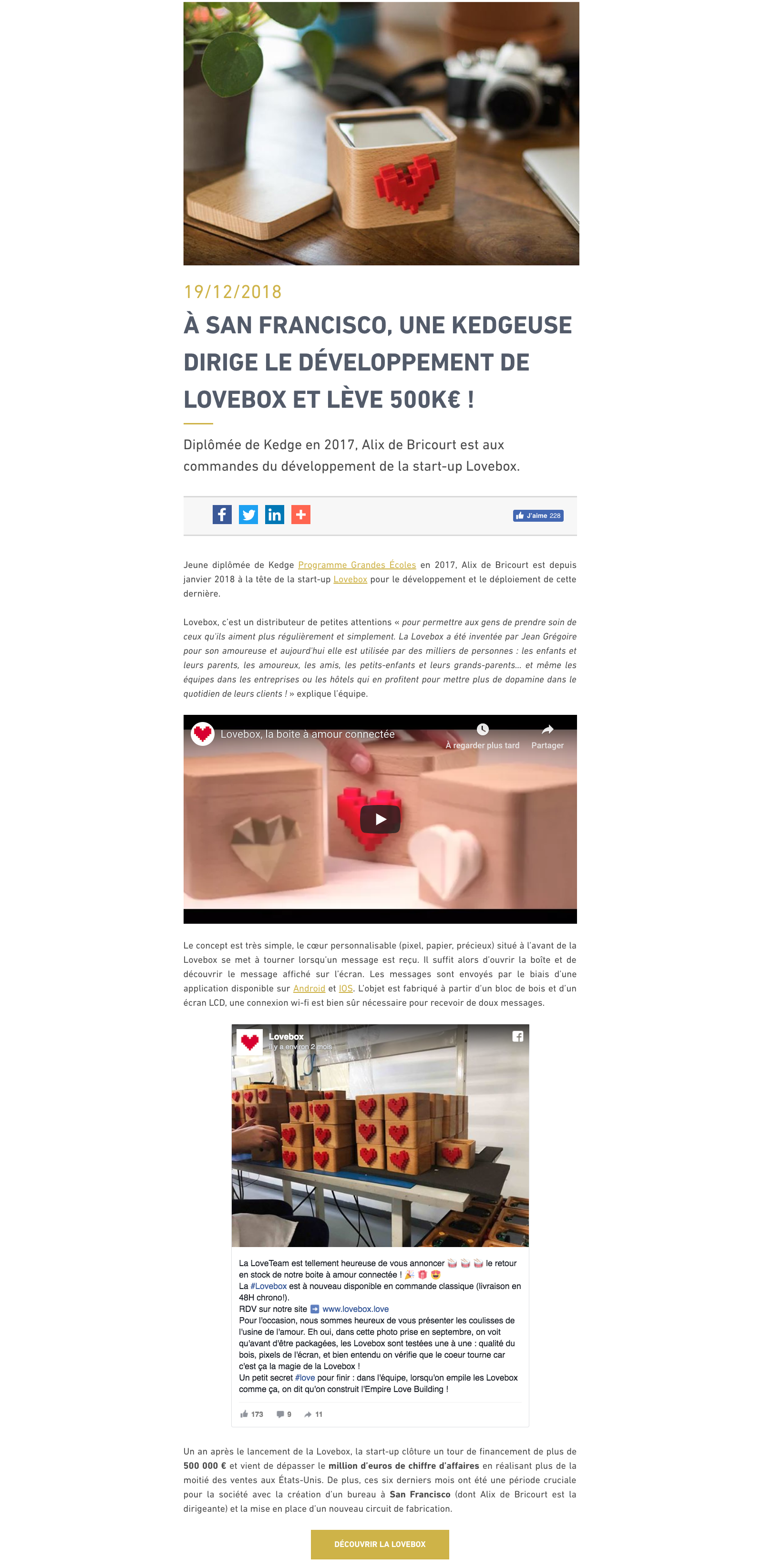
Finally, our solution allows you to personalise your publications. Inserting images with a frame/resize tool, formatting text, adding CSS styles… all tools to enrich your publications as you wish and respect your visual identity. Below is an example of a Kedge Alumni news item, which integrates text, videos and Facebook publications. Customised developments are also possible to personalise your publications even more, such as the action button in the association’s colours at the end of the news item.
ANY QUESTION ?
